
 字體:小 中 大
 |
|
|
|
| 2018/01/24 10:42:26瀏覽76|回應0|推薦0 | |
勝元室內裝修有限公司 Architect Liang & Sheng-Yuan lnterior Design 梁明勝 Ming-Sheng Liang TGI FRIDAYS餐廳位在車水馬龍、人聲鼎沸的林森北路,緊鄰14、15號公園旁的一棟複合式百貨一二樓,室內空間包含酒吧、開放廚房與主要用餐空間,延續FRIDAYS餐廳的品牌精神,設計師以帶有繽紛色彩、明亮光線的美式鄉村風格樣式進行設計,讓餐廳整體呈現出清鬆、悠閒的質感。 TGI Fridays is situated on the Linsen North Road, the area of heavy traffic and confusion noises, and it is built on the ground and second floor in a composite mall. The inner space includes bar, open kitchen and dining area, extending the spirits of FRIDAYS. The designer fulfills the restaurant with colorful and bright America country style, presenting the atmosphere of putting people at ease and relaxed.
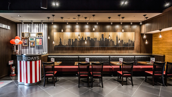
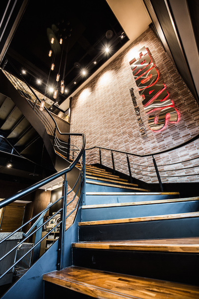
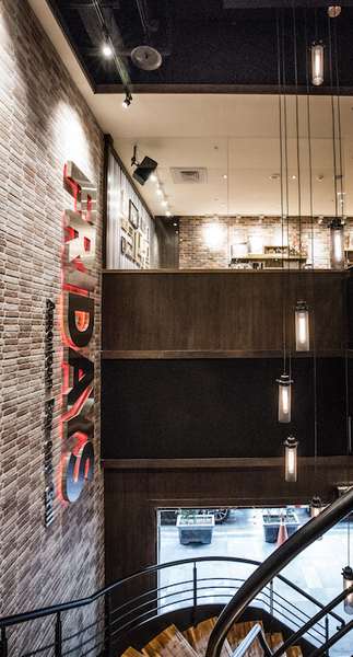
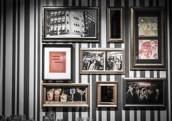
由一樓的獨立出入口進入餐廳內,一座大型鍛造迴旋梯矗立其中,黑色系的地磚與天花板,樓梯旁挑空至二樓的文化石磚牆壁面與垂吊燈飾,呈現出風格獨特的玄關場域。另一側為成排的座位區,以黑紅雙色搭配的沙發與座椅,輔以深色木質貼皮牆面與高樓天際線的剪影畫作,搭配樓梯下方的飲料吧,在有限的一樓空間中,營造出沉穩中帶有時尚感的大廳氛圍。 We can see a large forged staircase when coming into the restaurant through a separate entrance. The black bricks and ceiling, the cultured-stone wall, and dangling lights, present one of a kind porch area. On the other side of the seating area, creates the sedate and fashioned lobby atmosphere on the limited-space first floor by using black and red couch and chairs, dark wood veneered wall, and the painting of skyscrapers.
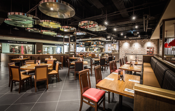
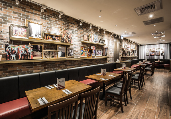
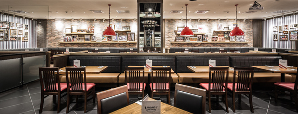
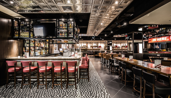
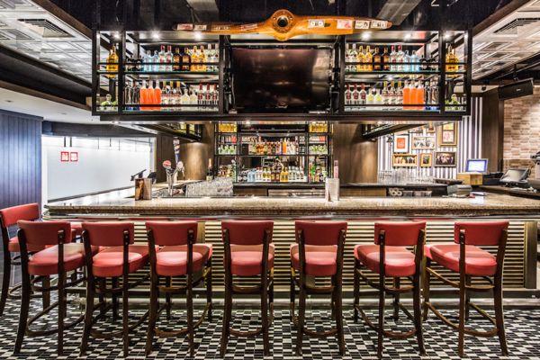
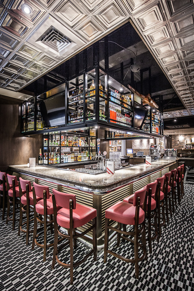
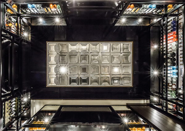
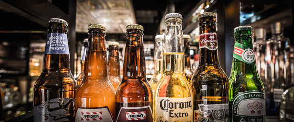
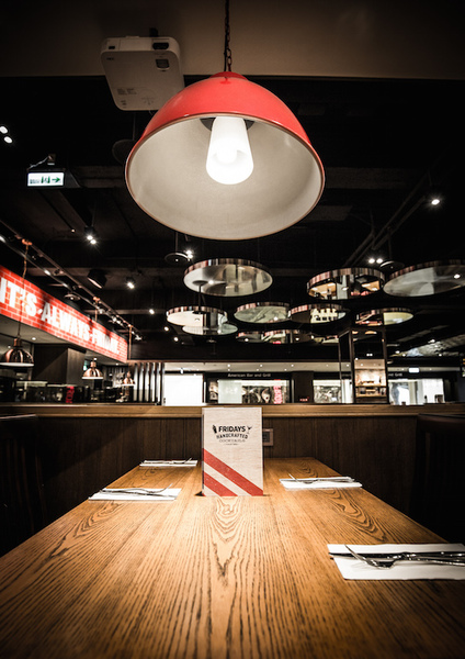
沿著迴旋梯踏上二樓,廣闊無阻隔的用餐場域躍然於眼前,在全然開放的空間內,設計師藉由不同的天花板與地磚設計,分隔不同的空間機能屬性。在樓梯右側,以黑白相間的小型馬賽克磚地板鋪面、方形金屬亮面天花板、鍛造金屬酒架與紅色吧台椅,搭配色彩繽紛的各種酒類製品,混搭出別具時尚特色的酒吧區域。在廣大用餐空間中,整體仍以紅、黑、褐三色為主要搭配色調,設計師延續一樓座位設計的思考,臨牆面與結構柱的一側規畫為長形沙發座椅,另外也以不同的方桌、圓桌及長桌配置錯落其中,活潑多樣的餐桌椅組合,配合天花板上散置的圓形鏡面裝飾,增添了空間的趣味與變化。 After walking along the staircase to the second floor, we can see the dining area where is wide and obstructiveness-free. In the open space, the designer distinguishes the mechanisms by designing different ceilings and bricks. At the right side of the bar, the fashioned bar area is built by installing the floor paved with small black-and-white mosaic bricks, the square metallic ceiling, the forged metal bar, the red bar stools, and colorful liquor. The main colors, in the wide dining area, are red, black, and brown. Using the same design ideas on the first floor, the designer puts the long couch which is close to wall and structural column. On the other hand, the different square, round, and long tables are installed on the same area. The varied table-and-chair sets, with the round mirrors on the ceiling, endow the space rich in fun and changes. 設計師巧妙地透過鐵件金屬、木質材料、玻璃、鏡面、文化石磚牆與裝飾擺設的混搭,讓用餐空間呈現出豐富、多層次的複合質感,藉由設計手法的運用,串連起人與空間的互動關係,讓餐廳本身也能成為融入員工熱情與顧客笑容的主角。 By using the iron products, wooden materials, glass, mirrors, cultured stones, and furniture, the designer ingeniously presents the abundant and composite quality. The design skills connect the interactive relationship between human and space, making the restaurant become the major role integrating employees’ passion and clients’ smile.
|
|
| ( 不分類|不分類 ) |


