
 字體:小 中 大
 |
|
|
|
| 2018/01/15 10:29:42瀏覽164|回應0|推薦0 | |
大盒子設計工程有限公司 Inner Flow Design 吳青純 Chin-Chun Wu
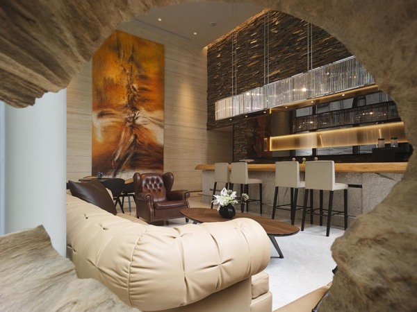
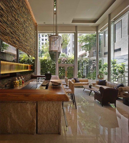
良好的社區公設設計能幫助居民享受多樣的生活姿態與交流機會,而追求生活中所能觸及的自然感,一直是近年來人們內心的渴望。此公設案一樓,可以看見設計師的設計範疇,從戶外景觀石塊砌疊而成的水瀑牆與綠意盎然的植生牆,延伸至室內挑高潔白細柱的休閒空間中,空間重點的吧檯區,同樣以大面自然石材、原木桌面做為室內外延伸,並加入LED鍍鈦金屬板的元素進行結合,金色光束形成的光面,成為原始粗曠中的精緻美學,視覺上的衝突卻絲毫不違和,自然而生的美感,展現高貴精緻與對細節的重視,足以讓人細細品味。以空心枯木的角度窺探,猶如初見洞穴中蘊含原始生命力量的純粹,守護著安全感和隱私,精選的室內畫作力度線條,也如編織而成的獸皮,色系也和室外原石疊砌呼應,思考邏輯清晰且處理手法上,大氣而細膩。 A well-designed public area in a community offers residents the diverse life styles and communication opportunities, in which the desire for living in a natural place has been in deep minds for most of the people. On the ground floor, where the public area located, the designer’s ideas are ubiquitous from the perspectives of that composed of the outdoor rock waterfall wall and greenery plants wall, the indoor bar area, which furnished with rocks and log tables extending outward, and the titanium-plated LED board, which the golden light has become the harmoniously delicate aesthetics in primitive form in which the unsophisticated beauty demonstrated the concentration on noble delicacy and details that are heart breaking. The design of hollow logs represents the power of original lives which secure the environment with privacy. The indoor paintings, in the meantime, act in cooperation with the outdoor stones, the logical and apparent skills that are both majestic and delicate.
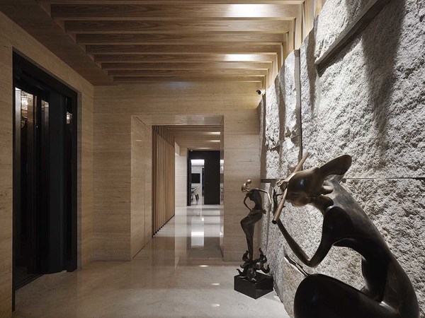
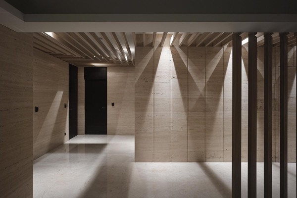
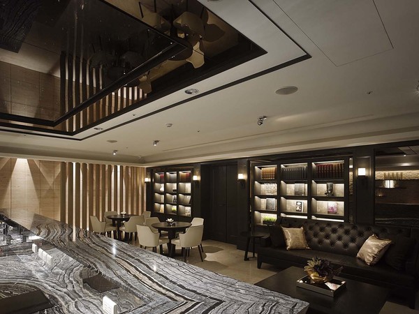
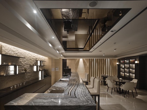
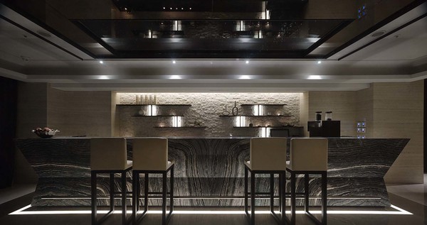
休憩等待室和更衣梳化間等空間設置服務於四樓的泳池SPA區,此層建築空間無特別挑高,更衣梳化室屬於SPA區與休息室的過渡空間,因此設計師所採取的策略是室內半戶外化,天花採取了格柵式處理,配合燈光計畫投射,頓時宛如室外自然天光的照耀。光滑拋光石磚地面與粗糙面的石材牆碰撞出衝突的美感,並且延伸至石材本身的紋理布局,地板的行雲流水石取自於水與蒸氣的流動與繚繞,而壁面則是伊朗銀灰洞石自然的水平紋理。在停留時間較久的休憩等待室,則運用了錐狀石材本身收邊俐落的斜角造型,淡色粗糙原石背牆上則崁入水平亮面深色石版,同時安排不同寬帶的垂直照明,強烈刻劃且巧妙帶出輕盈的空間性格,搭配流動感紋理的原石吧檯面,並透過天花燈光計畫透射,使石紋如水般流入地面矩形方圈,同時帶出空間視覺漂浮立體效果,天花則是黑色磨鏡加以點綴成如夜空繁星的LED,放大垂直向度視覺感受,讓住戶能使身心靈徹底放鬆。 The swimming pool and SPA are built on the fourth floor, on which the rest room and dressing room are functioned as a medium so that the designer has made part of the indoor space become the outdoor environment by building up a grille ceiling and lights that make the inner space filled with natural lights. The beauty of inconsistency is created by polished stone floor and coarse stone wall, which correspond to stones configurations that the flowing water and swirling steam present the image on the floor and the travertine from Iran presents the horizontal patterns on the wall as well. The rest room, in which people may stay for a while, is furnished with the slope style made by cone stones. Furthermore, the light-colored coarse stone walls are embedded with dark stone plates, with the different vertical lightings, have ingeniously put an emphasis on the lithe characteristic of the space. The stone bar, with lively table patterns and by means of ceiling lights, has made lines on the stones ,as if water, flow on the floor, and created the floating 3-D visual effect in the space. The LED ceiling, furnished with black mirror, has magnified the visual effects from every dimension that bring the residence the most relaxing feeling.
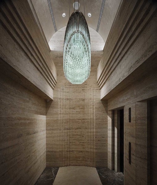
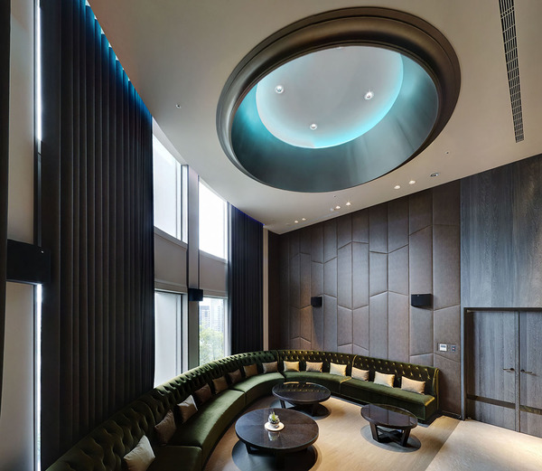
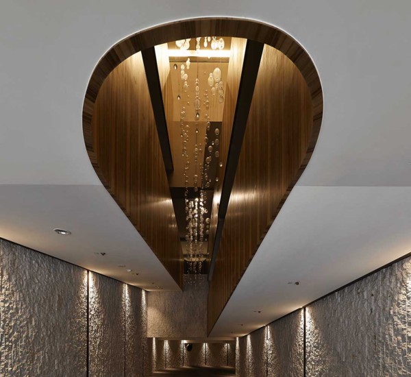
位於屋頂層的KTV歡樂練唱室,室內面積雖不大且平面形狀因應屋突設計呈現為四分之一圓弧形,但樓層高度高,設計師大膽規劃橢圓的天頂燈以放大室內視覺空間的完整性,略帶科技現代感的藍燈、橄欖綠絨布沙發、銀白色抱枕也透過燈光變色而改變著表情,隨著良好設備所播放的樂曲完成不同的氣氛,壁面布置了吸音泡棉並表上精緻皮革,阻隔空間彼此的干擾性。而車道入口設計更是精采,一般車道入口設計較為陰暗容易被忽視,設計師不放過任何空間營造的可能性,運用室內材質於此半戶外空間,U型純白天花如柔緞隨著車道上下流動,精緻木紋質感貫穿平順整個挑高面,一圈圈向上走,繞著建築體弧度,反射著光暈的晶透玻璃球不規則錯落,由高處傾洩而下,如天降甘霖的雨露,充分運用了斜坡道本身獨一無二的空間特色,醍醐灌頂般洗滌回到家疲憊的心靈,顯得自然中的貼心與細緻,對準住戶在使用機能的每種心境,充分展現設計師在處理衝突美感中的深厚設計實力。 The KTV, on the top floor of the building, is designed into an arc space, for the limited inner space. Taking advantage of a tall building, the designer innovatively furnishes the inner space with oval ceiling light which magnifies the whole space. Followed by the great audio equipment that play different music for different atmospheres, the modern blue light, olive green flannel couch, and silver pillows express diverse atmospheres by different lightings. The walls, furnished with sound-absorbing foam and leather, has isolated the interferences among spaces. The entrance of the driveway, generally negligible for darkness, has been designed with white U-shaped ceiling that the delicate wood grains curling up, along the building structure, and flowing down as if raining, the design calming the mindsets after working all day long and demonstrating the designer’s skills in processing inconsistencies appropriately when confronting with different demands for a number of residences. |
|
| ( 不分類|不分類 ) |


